8/11/2011

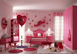
Bedroom Mural for Kid's room

interior design kids room
Using the overhead projector, that one-time staple of lecture halls, parents and kids can turn any traceable image into a mural. Simply project an easy-to-make transparency of an image onto the wall, trace it, then fill it in as though you're painting in a giant coloring book. The result is a professional-looking, inexpensive mural that can transform a blank wall into a truly unique focal point of a kid's room.

Materials
  • Overhead projector (you can borrow or rent one)
  • Transparency film (available at office supply stores)
  • Fine-tip markers
  • Masking or painter's tape
  • Paints (interior latex and artists' acrylics)
  • Paintbrushes in various sizes for outlining, filling in, and detail wor
Instructions
  1. Choose an image. We suggest sticking to fairly simple, two-dimensional pictures or designs that don't rely on elaborate shading or perspective. And the fewer colors the better. If your child has trouble selecting a favorite, check out the clip art sources at left (Daphne Jensen found her image on a CD-ROM of clip art). Any image that can be traced or printed onto transparency film will work.

  2. Location, location, location. Decide where you want the mural. Do you want to incorporate architectural details? For instance, you might paint a jungle animal "sitting" on a radiator.

  3. Make the transparency. There are three ways to transfer an image to transparency film: use a fine-tip marker to trace the picture onto the film, photocopy the picture onto the film, or use an ink-jet or laser printer to print a computer image onto the film. Decide which will work best for your image, then purchase transparency film (boxes of 25 sheets start at $4) at an office supply store. Note that different types are sold for tracing, photocopying, and various printers.

  4. Project your picture. Borrow an overhead projector from a school or church or rent one from a rental shop. Experiment with the distance you project from and the size of the image on the transparency to get the mural dimensions you want. (For the mural Daphne made, the baseball diamond on the transparency was 5 inches tall, and we set the projector 10 feet from the wall to enlarge it to almost 4 feet tall.) Use a pencil to trace the outline of the projected image (including any shaded parts) onto the wall.

  5. Select your paint. Interior latex paint, which comes in quarts, is best if you're painting a few colors and filling in relatively large areas. For detail work, use artists' acrylics, available in tubes and bottles at craft and art supply stores. You'll also need appropriately sized paintbrushes.

  6. Paint like a pro. For a more realistic effect, paint the background before the foreground. Step back from your mural regularly to see how it looks from the distance it will be viewed from.

http://familyfun.go.com/

How to Make Butterfly Kids Room Decorations


Butterfly décor is popular for kids' rooms. A number of retailers offer readymade decorations or craft kits to make your own butterfly kids room decorations, like those from Pottery Barn Kids.
But why spend a bundle of money when you can make your own. This is a fun craft to do alone or with the kids. These steps will help you create fun, one-of-a-kind butterfly decorations for a kid's room or anywhere else in the house.
Instructions
Things You'll Need

Butterfly pattern
Craft paper (heavy scrapbooking paper is best)
Pencil
Scissors
Spray Adhesive
Card stock or lightweight cardboard
Hot glue gun or craft glue

Suggest Edits

1

Find or create your own butterfly pattern. Look online for already created butterfly designs or look through science books. It isn't the detail that's important, but the shape. Keep the pattern simple; after all you will be cutting out each of these butterflies by hand so less fussy is better. Enlarge the pattern if necessary. Seven to eight inches is a good size.
2

Mount your paper butterfly pattern onto the card stock with spray adhesive. Mounting the pattern on heavier stock will help the pattern last longer, especially if you plan to create a lot of butterfly decorations.
3

Select the paper for the butterflies. Heaving scrapbooking paper works best (and also come in lots of cool designs). Look for paper that has patterns or color on both sides, because you will see the underside of these butterfly decorations.
4

Trace the butterfly shape onto the paper. Use the scissors to cut out the butterflies.
5

Bend the butterfly wings at the bodyline so the wings stand away from the surface they are mounted (and look as if they're flying).
6

Use the hot glue gun or craft glue to stick the butterfly decorations to the wall or other surfaces. These butterfly kids room decorations will delight all who see them.

http://www.ehow.com/

8/04/2011

New! 2012 Color Trends Home & Interior – All 9 Pantone Palettes!

Here is the full Pantone color release for Interiors & Furnishings, and Pantone’s own color stories regarding all nine color palletts! I don’t normally quote content, but as the creators, I thought you might be interested in reading Pantone’s reflections about the creative process behind this year’s color trends, straight from the source. Everyone will have favorites, but I love “The Comics” for this group’s fearless and pure color bravado. Throughout this week, I’ll take a look at the color palettes individually, and hopefully contribute meaningful thoughts and impressions on making these diverse color groups work in your home, in 2012 and beyond…

“The nine palettes for 2012 are: Nonchalance, Subtleties, Resilience, Indigo Effects, and Transcending Time, Back to the Fuchsia, Reflections, Nouveau Neon and The Comics”.

Pantone Nonchalance Palette

“The simplicity and casual ambiance in this palette, called Nonchalance, are easy to read and enjoy. The reassuring colors coax a feeling of tranquility and relaxation with no suggestion of anxiety in the surroundings. The comforting pastel pinks, ethereal blues and soft egret white wrap us in carefree baby blanket colors, harmoniously blending with the more mature taupe, gray and grape tones”.


Pantone Sublties Palette

Subtleties are just that – a close connectivity between the color families, sliding effortlessly into a seamless collection of hues that are either closely related or quietly complementary. The atmosphere they present is effortless and compatible: hazy coral, soft yellow green, faded rose, stonewashed blue and tinges of gray and green artfully set against a tasteful brown earthy red.

Pantone Resilience Palette

Resilience represents a group of sturdy hues that work very well together. It speaks of hand-hewn objects of substance, sustenance and solidity in a range of natural, outdoor shades. There are nuances of the deepest browns, varietal mushroom tones, foliage green and greenish yellow. A dash of flamingo orange adds an exotic touch to this otherwise organic grouping.

Pantone Indigo Effects

Like the twilight colors of a descending night sky, Indigo Effects evokes a mood of broad expansiveness and depth – enveloping and protective, yet mysterious. The colors are variations on a blue theme – celestial and majestic blues, purpled and deep blue indigos – all deftly brushed with contrasting strokes of maroon, mauve and moody gray.

Pantone Transcending Time Color Palette

Transcending Time is a palette that speaks of continuity – inspirations from the past, both style and color-wise, which continue well into the future – containing hues that heirlooms are made of, including elegant wine and plum, warm beige and wood tones, as well as classic rose. A touch of frosted almond adds a soft and subtle glimmer to the atmosphere.

Pantone Back To Fuschia

Bold, daring and audacious, this is a group of tantalizing colors that makes no excuses for the attention it creates. Back to the Fuchsia celebrates the energy generated through the provocative melding of dancing reds, purples and pink, all highlighted by a variety of fuchsias. Jewel-toned peridot both accentuates and complements the hotter hues.

Pantone Reflections Palette

Glossy finish and color are a magical coupling, fascinating the eye and riveting attention. Metallic or glassy surfaces undulate and move and twist and turn, taking colors to new dimensions. Included in this arresting palette, called Reflections, are tones and tints that spark the imagination: Turkish sea, blue moon, garnet, beluga, cloud dancer as well as the classic silver and gold.

The colors of the Nouveau Neon palette are not the phosphorescent neon’s of yesterday. They are instead a collection of exuberant shades that bring a fresh new perspective to combinations. Asian-inspired bamboo yellow-green plays with orange Popsicle® and berry purples, while citrus colors toy with pink and raspberry. A flavorful butter-rum tan is the unexpected accompaniment to all of the vibrant colors in the palette.

Pantone Nouveau Neon

Taken directly from Pantone’s press release, and chicago unveiling of the Spring/Summer 2012 Color Trends Report.

http://redoitdesign.wordpress.com/

Home Trends: Autumn Winter 2012/13

We recently published our Autumn / Winter 2012/13 Lifestyle Trends for the Home book, featuring four key trend directions, complete with 40 colour swatches with closest Pantone reference, actual material samples per trend and hundreds of original images styled and photographed by our team.

The books are a result of 6 months work, from our initial trend panel where we invite industry experts, forecasters and ‘unusual thinkers’ to share their ideas for the future with us, through to editing and honing the trends into workable and commercial trends for our global audience.

For A/W 2012/13, we have covered four main themes; Undone, Curiosity, Grey Gardens and Wild Spirit. Our books include a Colour Evolution component, demonstrating how colour is evolving changing and trending from season to season so that you know the key colours and how they develop over time.

To place an order for one of our limited edition trend books, please contact us at enquiries@trendbible.co.uk or see our Agents page for your nearest regional agent.

http://www.trendbible.co.uk

Design with Fibers

Wor


A natural decor, working with wood

Historically, wood is used in decoration for the beauty and comfort it offers. With other materials such as steel becoming less popular, wood has made a return to household interior design with its varying shapes and interpretations. This completely natural material is invited in all parts of the house, but is usually in bathrooms and kitchens. Used mostly for floorings and finishes, wood has a strong heritage of household use. Even trees that were uprooted by the wind or fell in a rain storm, once shaped and polished, are perfect for creating unique tables, chairs, and shelves.
Natural fibers for a sober decoration


Natural fibers are specifically selected for their beauty and practicality. Sisla comes from the leaves of the agave cactus, from Mexico. This is probably the most sophisticated fiber, as it blends sweetness and consistency. Cior, another fiber offers a more rustic appearance and generally used to create a relaxing environment. Another fiber, sea grass, is a great fiber that is mainly used because of its resilience to humidity. Last off, the banana fiber, also known as abbaca, once dried and braided offers a material with various color tones.


Concrete, a material for a sober decoration

For years, concrete has mainly been reserved for construction uses, but today this material is used frequently in home decoration. It is used on walls, floors, and even appears on some furniture. Of course, these uses are purely decorative. Some designers favor concrete for its flexibility and malleability, but also for its reminiscent nature. Recently, technology has granted the ability to create light weight concrete, streamlining designs, and removing all of its weight in terms of decoration. That aside, concrete has a great ability to blend well with other materials such as wood textile and even steel.

http://www.adesignerspot.com

2011-2012 Trends in Interior Design

2011 brings forward old ideas remodeled according to new trends, effortless elegance, vivid colors, striking and out of the ordinary combinations and contrasts. This year, we should all embrace colors that we wouldn’t normally associate, combine intense shades with balancing tones and think out of the box, giving our home a brand new personality.

2011-2012 Trends in Interior Design

Dare to celebrate neon shades, using fluorescent green, yellow or pink, delivering thus new accent elements to your freshly decorated interior. Since these powerful colors tend to draw attention, combine them with neutral shades such as white and gray that will soften the visual impact. The striking atmosphere thus achieved will definitely be one of a kind.

Make up elegant color combinations like black and gray, black and silver, light blue and gray, emerald and white, gold and white, orange and gray, lavender and white, tan and black. You can also mix styles, using a minimalist interior with accent furniture elements, like an art nouveau armchair in neutral, natural colors (black leather, cinnamon or brown velvet).


The Romantic style will never be outdated when it comes to interior remodeling. Apply pale shades of pink and gold, use various textiles – mostly white – printed with floral motifs, add flowing veil drapes and curtains, place thin pale carpets on natural wood floors, accessorize the interior space with elegant paintings depicting mystical images or natural sceneries and give your home a fresh touch with flower vases.

When it comes to creativity and high spirits, let your home speak for itself with daring colors. Use orange if you are slightly conservative, blue if you are a calm person, red if you are highly active, energetic and impulsive and pink if you are affectionate, playful and spontaneous. Whatever color you choose to apply, be sure it fully represents your personality, delivering the desired atmosphere.

Gold is still in being one of the most elegant and noble colors. Apply gold accents if you want to achieve a glamorous interior setting and use matte, antique shades to avoid opulence.


Go for a dramatic effect by mixing vivid shades of colors, such as red and mustard yellow, turquoise and yellow, orange and green, yellow and brown. Use softer shades and you will achieve a calm and relaxing atmosphere.


As always, it is up to you to enable these suggestions to perfectly fit your personality and your home décor. Choose whatever inspires you and let your creativity decide upon the best combinations, delivering

http://www.adesignerspot.com

8/02/2011

What vector and raster image are?

Graphic designers use many different tools to create beautiful images, but there is a very important technical side to the profession. Designers need to not only create art, but they must also hand over the art to the client in the correct file format. After all, what good is a design if it can’t be used easily by the client?

Understanding File Formats

There are two types of drawing programs used when drawing on the computer: Vector and Raster. Clients need both types of graphics, but don’t run out and buy more software – let’s first understand the differences.

Vector

Vector images are made up of lines and curves with points. To simplify a very technical description, a vector graphic is made up of lines and points with information attached to them. For example: If you were to draw a circle, the drawing would be made up of a line with a curve (360 degrees), a beginning and end point, a specific size, an outline color for the line, and the “fill”, or the color inside the line.

What makes vector images popular among graphic designers, printing companies, and other people who work with images is the fact that vector images are scalable – they can be easily made larger or smaller without losing any image quality. When you change the size of the image, the software simply redraws the design in the new size.

Professional designers also create vector images using “layers” – a feature which allows designers to isolate each element of the design in its own space. When all of the layers are shown together, the entire graphic looks like one image. Using layers makes it easier to change vector designs at any time – any designer can take a vector image file and look at individual layers to change the colors, fonts, or layout of a design. This is useful for an image that will be used with different media – a logo printed on a brochure can be more detailed and smaller than a logo sewn on a hat.

img1 Vector vs. Raster – The Final Showdown

File formats: .ai .fh .cdr

Common Programs: Adobe Illustrator, FreeHand, CorelDraw

Raster

Raster files are images made up of square dots, called pixels. Each flat dot can be a different color in your picture. When you look at the dots from far away, they blend together and produce beautiful images, but when you zoom in, you can see the pixels.

img2 Vector vs. Raster – The Final Showdown

What makes Raster images different is that when you want to make a picture larger or smaller, the resolution quality goes down. When you enlarge an image, the edges of the elements in the image look boxy and bumpy because the computer has no idea what to put in between the pixels that are there, or how to smooth them out. When you shrink an image, the computer has to just throw away random pixels. The pixels themselves can’t be made smaller, so the image just needs to have fewer of them.

All of this might make using raster graphic sound inferior, but they actually have specific uses that make them better than vector images:

  • Internet: Raster files are smaller, so websites download faster.
  • Photographs: Digital Photos are always raster images, and they are easy to take and edit.
  • Clipart: You can insert raster images into a document or presentation in seconds.
  • Screen resolution: The resolution of computer monitors are all the same, so raster images always look good.

File formats: .bmp .gif .jpg .png .tiff .pict .psd

Common Programs: Adobe Photoshop, Adobe Fireworks

So Which One Do You Use?

When you deliver a logo or a graphic design to a client, always deliver both formats. Customers will ask for “source files”, which mean files that can be edited and changed. A client may need vector files for printing, but raster for a posting on a website. Experienced designers have figured out an easy way to provide both types of files – design the original graphic using a vector design program, and then create a variety of vector and raster-based versions of the files from it. For example, using Adobe Illustrator it is easy to design a vector logo, select “Save As” and then choose both vector and raster-type files formats required by the client.

www.mycroburst.com